


Richard Bruning has never really come to terms with the DC Bullet. The Milton Glaser-designed logo, debuted by DC comics alongside their official name change in 1976, has long been regarded as a classic of comic book design, but to hear Bruning tell it, it’s nothing but a sum of its errors: it’s too unbalanced, too loud, and above all it positively reeks of the 1970s.
That sort of opinionated iconoclasm was once a defining characteristic of Bruning and it was, ironically enough, the thing that got him hired as the Design Director of DC Comics about a decade after the bullet made its debut. Bruning had come out of the graphic design world in the college town of Madison, Wisconsin, where he came to the attention of local comic distributors-turned-publishers Capital Comics, who soon enough hired him on as both Editor-in-Chief and Art Director of the nascent (and relatively short-lived) comic line.
It was there, in the first years of the 1980s, that Bruning helped to pioneer a new aesthetic for comic design: unapologetically modern, disdainful of the old tropes of floppy issue packaging, and aiming for an aesthetic and an audience apart from hermetic world of devoted superhero readers.
Bruning, in short, was one of those early voices in favor of a comics business that wanted to be a part of the mainstream market, not a marginalized subculture, and in this he echoed the aims of DC Comics during the mid-80s high tide of Jenette Kahn’s tenure as president. Joining the DC staff in 1985, Bruning was intrinsic to the creation of the experimental design formats that the company debuted with an eye toward public acceptance in the years after Watchmen and Dark Knight – whose pioneering collected editions Bruning packaged and designed.
You can get a glimpse of that joint effort between Bruning and Kahn (or, at least, the way they wanted the world to see it) in the “publishorial” Kahn placed in the inner flap of DC’s fancier “new format” comics in June, 1988. That piece gives us a Bruning “bent over his desk in intense concentration,” cognizant of the particularities of paper stocks and color saturations, hopping from the press at Ronald’s Printing to the production bullpen at 666 5th Avenue. “It’s a really exciting time for comics,” Kahn quotes Bruning as saying, “because it’s a chance to examine all the ground rules, to throw out those that don’t work, to make new ones. It’s scary and frustrating sometimes, but the freedom to try and make mistakes allows us to achieve things we’ve never achieved before.”
During his first stint at DC, from 1985 to 1990, Bruning both helped steer and, provides a candid witness to, an era in which mainstream American comics began to dream of breaking past the invisible wall of cultural disdain, and become at last a part of the media mainstream. Whether they succeeded, or to what extent, remains even now in the eye of the beholder.
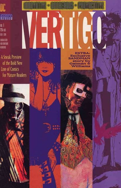
Later on, Bruning would return to DC for an even longer tenure during the 1990s and 2000s, becoming a major player in the creation of the Vertigo imprint (overseen by Bruning’s wife, Karen Berger, whom he met in the DC office), the push for digital design, and the eventual clashes that started to embroil the company as its leadership changed and merged in the new millennial. But in the first part of this interview, he talks about his early work in graphic design, his entry into comics, and what it was like designing DC Comics in the era when it Wasn’t Just For Kids(™).
ZACH RABIROFF: Let’s go way back. Tell me about your childhood. You’re from Wisconsin originally, right?
RICHARD BRUNING: No, that’s what everybody thinks because I spent so much time there. So I’m forever cursed to be a Wisconsinan. No, I’m from upstate New York. Middletown, hour and a half from the city or so. Smallish town. I started drawing when I was very young; I always wanted to be a cartoonist, and create my own little comics.
So you must have been a comics reader as a kid.
Yes, absolutely. Actually, I learned to read from comics. It was when I was pretty young, five or whatever. I had scarlet fever, and I was stuck in bed for quite a while. My father brought me a box of gray market comics. And I just plowed through all these comics.
Gray market, meaning the stuff that just fell off the truck, so to speak.
Yeah. The ones that are missing the top third of the cover where the logo is. My first comics were like that. I didn’t know what the title was of the comics I was reading sometimes, but it didn’t matter. It was all cool. I remember years later learning to read the indicia.
My youngest years were typically DC comics. And we’re talking late 50s, early 60s. So a lot of the silly stuff: the many colors of Batman’s costumes, that sort of thing,Lois Lane,Jimmy Olsencomics.And then a few years later, my family went to visit some relatives in New Jersey. When we got there, they took us to this giant barn where there was a swap meet. I walked in and in one corner of this huge barn, there was an enormous wall of comics. They were, like, 20 for a dollar. I just freaked out. Seeing Marvel Comics for the first time, seeing Stan [Lee] and Jack [Kirby]’s work – especially Jack, because his stuff was so impactful and almost rough. It was colored all in purples, and dark greens, and browns and stuff. Completely the opposite of the DC Comics aesthetic at the time, which was all bright colors, and happy, smiling faces, and nice Kurt Schaffenberger art.
When you first discovered Marvel, did you know that it was Jack Kirby that you were reading?
No, it took a number of years until I realized who the artist was. But very quickly after that, I learned who the inker was, because the inker made the penciler look so different. Jack Kirby was a lot different than George Bell or somebody else.
Or Vince Coletta.
Yeah, God forbid. Once I learned that, I felt like I was really starting to understand how the comics worked. I was like, “I want to do this. This is what I want to do when I grow up.”
So that was the point where you decided you wanted comics to be your career?
Yeah, I may have always felt that way because I was always drawing little cartoon characters. Superman makes the biggest impact when you’re a young kid, I think, because of the wishful film and aspect of the character. But the excitement about the medium really came from the early Marvel comics, Stan, Jack and those guys.
Did you study art?
No, I actually did not go to college, unlike most of my peers. I was a little bit on the rebel side, and I dropped out of high school. I went back and got my GED the next year just to have it, although no one’s ever asked for it since then. I basically just started doing odd jobs so I could draw with the rest of my time, and ultimately fell into graphic design in my mid-twenties. It was a good thing, because I was having a harder and harder time convincing myself that I could be a full-time artist and sit at a drawing table six days a week, twelve hours a day. I liked to draw, but I didn’t like to drawthatmuch.
So how did the graphic design career come about?
People knew I was a cartoonist, and to them that meant an artist, especially back in the 70s. Graphic design wasn’t such a big to-do, but I worked at a small business, and they were like, “Hey, you draw, you could do our business card and posters and stuff.” I said, “I guess.” So I started doing that with a very cartoony sort of approach. I was very affected by Robert Crumb in my drawing at that time, where everything was organic and anthropomorphic – forks and knives and stuff.
How do you take that and apply it to a graphic design aesthetic?
To me, it’s all communication. You have different tools in your toolkit, depending on who you are. I was learning graphic design without knowing exactly what I was learning. I started picking up more design books and noticing how people use white space, and all the different possibilities with typography, and how to crop an image. I was trying to create something that clearly communicated an idea that someone wanted to get across. I found it was hard to get work as an artist, but almost every little business needed some kind of graphic design for a business card or a logo.
I started doing small business graphics. and then opened a graphic design studio in Madison, Wisconsin, where I was living at that point. Madison was a very creative town, a college town. I started to shape my understanding of design and how it worked. And then I met the guys that were part of Capital City Distribution. I was there when they first started the business, because we were all working at another distributor before that place shut down, and Milton [Greipp] and John [Davis] decided to start Capital City. They were my first clients, or one of my first big clients, and I did everything they did – all their invoices, all their catalogs, all their ads. I had to learn how to do all that stuff, but it was perfect for me because I was getting paid to learn, and they liked what I was producing. That did a lot to lift me up professionally in the design world, and I was able to make connections with other people. I did a flyer for Phil Seuling. I started doing a few things for Denis Kitchen, little things popping up here and there.
This was at the point when the direct market, as we understand it, was coming into existence. Were you aware of that as you went into this role at a small distributor?
A little bit. There were fanzines, but there was very little news about the business if you wanted to learn what was going on. I just picked it up by doing, and I managed to get hired by Dave Sim to do advertisements for Cerebus for a couple years.
That was a great gig. Dave let me do it for about two years, and I got paid well for it. The only time I ever got yelled at was when I took a little cut-out Groucho character [Lord Julius, a character from theCerebussupporting cast] from one of the stories, and put it at the bottom of the page as a little sign-off. I had him saying, “get me out of here!”, or something like that. This was when Deni Loubert was married to Dave and managing the business and she called me up. She said, “Dave really didn’t like it that you put words in Lord Julius’s mouth. You can’t write dialogue for the characters.” I was, like, okay, cool.
So you went from there into working for Capital Comics when that evolved out of the distribution business.
After the distribution company had been around for a few years and I was doing all their business graphic design, Milton and John approached me. Everybody was getting the idea that if you got the middleman cut out – because the middleman is now the publisher – you’ll make more money selling comics. Everybody thought that was a good idea, which it wasn’t, but whatever. So they asked me, “Hey, we want to get into publishing. Do you want to be Editor and Art Director?” And I’m, like, “Sure, cool.” I had never done it before, but I was always very much a, “sure, throw it at me” kind of person.
So sight unseen, you figured you could run the editorial end of a comic book company?
I did. I arrogantly did, yes. We started doing the black and whiteNexus, three issues of that magazine, and thenBadgeras a color comic, and then a couple of issues ofWhisper. But by that point, we were losing money and owing the printer, and so we ended up selling it all off to First Comics, who we were pretty good friends with.
I think we pulled the plug on it in ‘84. And that started another transformational stage – I guess, mysecondbig transformational stage – in that once I got off the hamster wheel, I had a chance to breathe. Publications just eat you alive because you’re always constantly working on the next one and the next one, then the next one. I decided I didn’t want to live in Madison anymore because it was freezing half the year. So the guy I was sharing an apartment with – a guy from Milwaukee – said, “You know what? I want to get out of here too.” And we were really good buddies, so I said to him, “Well, let’s move.” And we decided to move to California. Neither of us had jobs, but back then that was still feasible to do. I moved to San Francisco, did freelance graphic design there, not working really hard, and I was there for about a year when I got a call from DC Comics. Dick Giordano called.
And how did you get on Dick Giordano’s radar?
Back then – so now we’re talking about early to mid 80s, when graphic design first started to really flourish in comic books – you had people like Dean Motter working onMr. X. Neal Posner was the design director of DC, and he was starting to do some of the more elaborate graphic design formatting. Marvel decided to spruce up how they were doing their books. Neal Posner and I knew each other because there were just so few designers in the comic book business, and I’d been around the business long enough that I’d met people and gone to conventions. Neal had liked my work, and he recommended me for his position because he was moving on to work for the Metropolitan Opera.
Dick called me up when I was in San Francisco. I picked up the phone and he’s like, “Hi, this is Dick Giordano from DC Comics.” And I’m thinking, “Yeah, right.” But it was, it actually was. They flew me up to New York and showed me around. I sat and talked with Dick, and I talked with Joe Orlando and Jeanette Kahn. That was the first time I ever saw my future wife, Karen Berger, sitting in her office. She was on the phone, so we didn’t say anything. They offered me the job.
And this was what year when that meeting happened?
It was ‘85.
What do you remember them telling you about what DC wanted out of their graphic design?
They let me figure out what my job was, which was kind of weird. When they were first interviewing me, it was more like they were just trying to get a vibe off of me. I’m sure they asked me questions, which I no longer remember, or answers I no longer remember giving. But the topics were upscaling comics, graphic novels, all things I was very excited about. I was totally into as much modernization of comics as possible.
Modernization, meaning what?
Moving away from the 32-page pamphlet with the eight-page ad flap cutting into the story every couple pages, with semi-decent covers or whatever. And also, in terms of the marketing and promotion, the business was very unsophisticated. Not that I was a terribly sophisticated person, but I wanted to make comics available to more people. It was a mission for me, really, especially at that point in my life, because comics really didn’t get much respect. I thought that if you package stuff up really nicely, people will feel more positive about it than if you take the same content and present it in a shitty fashion. That was my underlying rationale, and they seemed to like that a lot.
Jenette was great. She was always very into design. Not so much graphic design, although she was really good buddies with Milton Glaser.
Right. She had brought him in to design the DC ‘bullet’ back in the 70s when she first took over.
Yep. She was very design conscious. [Vice President] Paul [Levitz] appreciated good design. Dick liked that the books looked better, but he was more about the content and the art, which was perfectly fine. We got along so well that there was no conflict there. Actually, about a week or two after I had been working at DC, I walked into Dick’s office and I said, “Dick, what exactly is my job here?” And he goes, “You’ll figure it out.” And smiles.
Even working independently, what was your department? Who were you reporting to day-to-day?
Day-to-day, it was a little confusing. The position I had was formally under Joe Orlando, and Joe was the VP head of the licensing stuff that DC did. Dick Giordano was the VP of the publishing stuff. I reported to both of them because I was working in all the areas. The company was pretty small then. I think there were 75 people [on staff], tops, when I left in 1990. So everybody did a little bit of everything anyway. I could grasp what most everybody was doing. I was involved with distribution, publishing, marketing and licensing.
1985 was a really interesting time to be coming into DC Comics, because they were heading into their big relaunch of the company withCrisis on Infinite Earths,and at the same time planning their rollout ofDark Knight. How did either of those things affect the work that you were being asked to do?
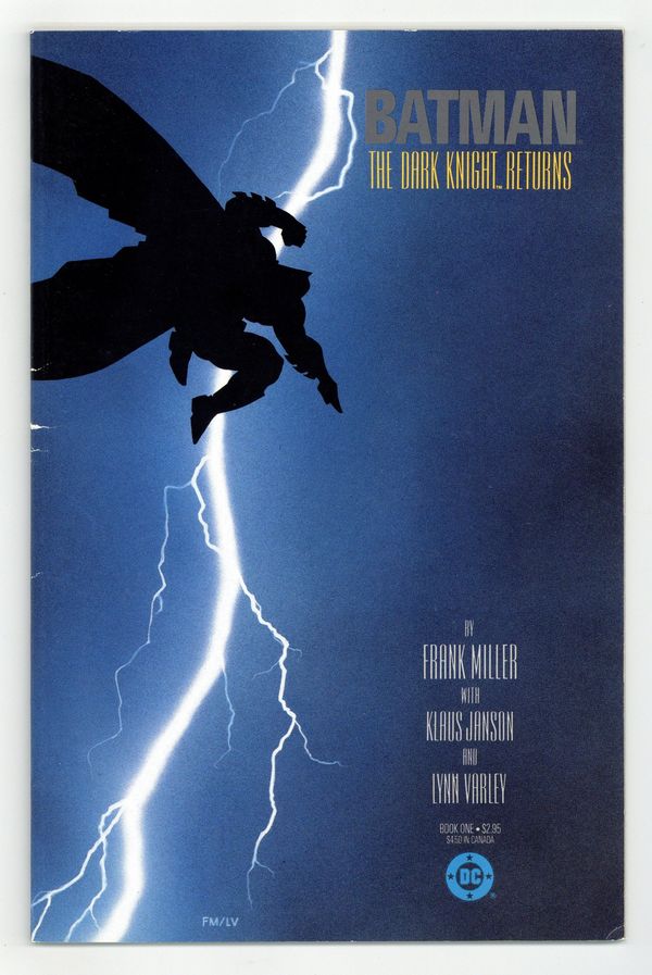
I am the luckiest guy in comics as far as I’m concerned. I walked in while they were buildingDark KnightandWatchmen. I got to play with both of them very, very intimately, as it were. One of the first meetings I had was with Frank [Miller] at Chicago Comicon a few months after I started, and we sat down and started kicking ideas back and forth about how to doDark Knightdifferently than a regular comic book. Frank had already argued for doing the prestige format with a square spine.Dark Knightwas the first time DC used that format.
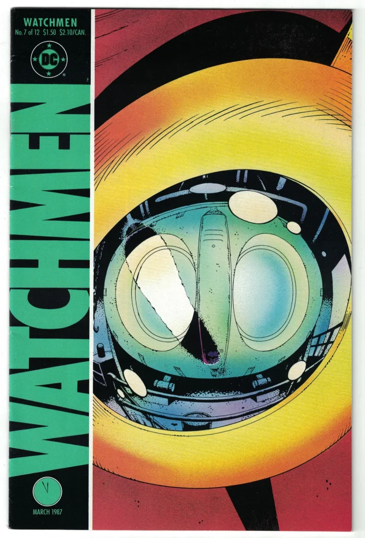
Alan [Moore] and Dave [Gibbons] had finished the first couple of issues ofWatchmen.I had realized thatWatchmenwas going to come out like a regular floppy comic with the staples on the side, but it was going to have an ad flat in it. And I said, “You can’t put a fucking ad flat in this book. Every page is just too perfect.” It was so well thought out, and so considered, that on the flight after San Diego Comic Con, I convinced Dick Giordano to take the ad flat out of there. I had to come up with something to do with the back of the book, because now we had eight pages to fill. I got to work with Dave and Alan on creating those back features, which were unique to each issue.
So you were doing the design work to make each of those back pages look like whatever the item was that it was supposed to be replicating?
Right, which was tremendous fun. Now,Watchmen’s inherent design was all Dave Gibbons. Dave had worked all of it out – the logo, the cover structure, the whole thing. I was the babysitter in-house over Watchmen. I took care of the back end of the book.
So then forDark Knight, how did you try to execute Miller’s vision for the design?
Obviously, not having ads opened up our ability to use all the surfaces: inside covers, back covers, all the things that used to have ads on them. We wanted to create a mood where you see this movie poster, which is the cover forDark Knight#1, and you open up the book and it’s like you’re going into the movie theater. The lights are coming down, and there’s the title across the screen, and then the action starts. It puts you in the mood. You’re going to start reading a dark story.
It’s interesting that you say that, because there is something very cinematic about the graphic design of bothDark KnightandWatchmen. You open it up, and it’s like a credit sequence on a black page.
Comics and film have shared a lot of attributes in terms of their development. Relatively early on in the process, we were looking at things like that. How do we make this look like a cool movie? Anything to push it away from the heavily kid-focused superhero tropes and obvious visual approaches. Not that there was anything wrong with that, but there was always a little bit of tension in DC, where I was trying to push comics forward, versus some of the more traditionalist editors.
Meaning whom?
Len Wein and I got into a big fight. Well, not a big fight. He was too much of a sweetheart to get in a big fight, but we got into a fight when I first got to DC and I was doing the cover designs. I started using typography on the cover text, which I tried to keep to a minimum, anyway. And Len didn’t like that. It basically came down to the fact that I want to use typography to make stuff look more sophisticated. That’s how I saw it, at least. And Len felt it was sacrilege not to have Gaspar Saladino do his beautiful lettering on the covers. Those were not big battles. There were just people in the business that didn’t want change. They liked being in this little clubhouse, and they didn’t want people from the outside world – normies – coming in and affecting their comics.
Aside from Len Wein, who were the traditionalists and who were the modernizers at DC?
There were a lot more traditionalists than there were modernizers. Some of the guys were cool with it. There was nobody in management that gave me a hard time about it. When we didDark Knight, I didn’t want to put a big DC bullet on the cover. I reduced the bullet down to about 65% of its size because I always saw it as a circus poster. It’s this big one-inch, loud circle up in the left-hand corner. Frankly, I had always wanted to get a new design for the logo. That’s something I started fighting for.
You never liked the Milton Glaser design?
It was okay for its time, but again, I think comics were at a turning point. In 1976, that looked perfectly fine. And it was appropriate for what DC was publishing in 1976. But once we started doing all these different independent works, and much more personal, much less traditional stuff like DarkKnightandWatchmenand such, it just didn’t feel right. It was like a circus poster, and it conflicted with the intent. So my first resolve was to reduce it down in size, and I even turned it so that it was no longer at a tilt. It was upright.
Glaser gave us a full style guide on how you’re supposed to use the bullet. But again, when he wrote that, there was no thought of doing much else in comics than the stuff that had been done for the last 40 years. The landscape of comics had changed and I thought we needed something different to address that. The bullet itself is not a great design because you have a lot of negative space, where the company’s name is DC, but it’s buried amongst all the bands and the circles. It was a pain in the ass. One day, Jenette came up to me and asked, “What happened with the bullet? It’s not supposed to be like that. And I’m like, “Oh, I didn’t know.” And I don’t think she ever said anything about it ever again, so I kept doing it.
Were you involved with the design of the collected editions for eitherDark KnightorWatchmen?
Well, at the beginning, given what I had been doing with the prestige format books, I was the collected editions editor. It was a packaging job, which I was certainly qualified for. I worked onBatman: Year Onewith Alice Walker. Then DC decided they wanted to do the Archive series, so I headed that up. I commissioned a design from Alex Jay, who’s a wonderful letterer, and then I developed the whole Archive line. I ended up passing most of the stuff on to other people when we had more regular publishing schedules.
Coming out ofCrisis on Infinite Earths,there was a push from Dick Giordano to different lines with different formats and different audience focuses. What did that mean for the graphic design work that you were doing?
Well, DC didn’t have a really clear game plan for what they were doing with all the different formats and stuff. They were still treating it as an experimental stage of, “Let’s try this for a while.” DC was good, in that they would give it a chance: give it a year, give it two years before they’d pull the plug. It was more of an organic development than it was a publishing plan. I’m sure there were more conversations that went on in rooms that I was not in. Paul [Levitz] was very exacting on what he was trying to accomplish and what his budget was.
Early on, when Dick Giordano was resisting the concept of a cover rating system for comics one of his rationales to the comics press was, “Well, we don’t need it because the audience is going to be differentiated by the different formats. The ‘New Format’ is going to be a higher class and appeal to a somewhat older audience than the main books.” I don’t know if any of that was conveyed to you at the time.
It was, in a sense. I know when Vertigo rolled around, which was later, the goal there was to have painted covers which were not common on superhero comics at all. I guess we were pitching that subtle cues would be enough for people to figure out whether material was mature or not. I think that may have been overestimating the sophistication of the reader. People who didn’t work in the business didn’t put that much thought into what were in the comics. So yeah, there was a lot of back and forth on the labeling, although I don’t really remember the minutiae.
But it became quite a controversy around 1987.
Yes, it did.
What do you remember about that from your perspective?
A lot of conversations. Sometimes people got heated about it. We were all trying to establish the best way to reach out to people. Was it better to tell people upfront that this is for mature readers, or is it better if they just [discover it on their own], like the way you walk into a bookstore? Regular books don’t have labeling for the most part, except, actually, for young readers now. But comics weren’t at the ubiquity of books yet.
Where did you come down in the debate?
Well, frankly, I didn’t see how it was going to harm anything to put the label on it. I knew I was going to have to design how it would appear on the cover, so that was okay with me. I remember we did debate it: is this something we will have to do for a little while and then we can drop it because people will come to understand it, or is it going to be more permanent? We didn’t know. There were considerations about whether comics would evolve to the point where you didn’t need to put a label on them: that people would have come to accept comics for being as diverse as they are now. But that’s about all I remember.
So in the immediate sense, it wasn’t changing the way that you were designing the covers, even considering what the rating or the content of the story would be.
Yeah. The design must match, reflect, and enhance whatever the story is, whatever the content is. That’s all that really mattered to me. And if you need to put two little lines of tiny type at the bottom on the cover, fine, we can put it down there. But the packaging, as I saw it, was going to be what the book required, whether it was labeled or not.
Are there particular projects or titles from that era that are particularly memorable to you?
It was fun to work onKilling Joke. That was another one where I got into a debate with Len [Wein], because Len had Richard Starkings do this playing card sort of design [for the cover]. I was determined that it was going to look more bookish and be a prestige format book: it was a fucking Alan Moore Brian Bolland Batman book, and it was going to look sophisticated. So I came up with the typographic approach we ended up using. That’s one of those things that people were not happy with me about, but ultimately I don’t think it mattered.
People, being the editors at DC?
Yeah. Because it was a blatant example of me walking away from comic book cover formatting as people had known it.
I’m curious what the rationale was for the people who were resistant to it.
It really just seemed to be a lot of, frankly, fanboy nostalgia. They saw comics in a certain way. “These are the comics I grew up with, and this is what I like. And don’t go try and prettify my comics or try to turn them into something that they’re not.” That’s what I would hear. My point of view, however, is that it’s evolution. I’m not saying you can’t do superhero comic books the way they’ve been done in the last 40 years or whatever, but I think certain things should be done differently. There were editors that’d been there for a while and had come up as fans, and they just really did not agree.
You’ve mentioned that Len Wein is somebody who stood out as one of the editors who wanted to keep things as they were. But conversely, were there people in the company who were trying to push things in the direction you wanted to go?
I got along pretty well with most all the editors to varying degrees. Closer to some.
And married one, obviously.
Married one. Karen [Berger] and I started working together, and we learned what we were both good at before we got involved in any kind of romantic relationship. That enabled us to continue working together for the last 30 years without killing each other.
So it was the fact that you were creatively in sync that allowed the marriage to work in the first place.
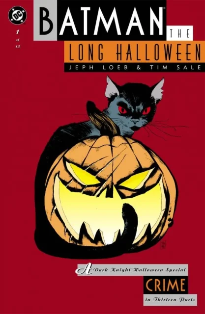
Right. I have a tiny regret about the last conversation I had with Archie Goodwin. God bless that man, I love him. It was a disagreement aboutBatman: The Long Halloween. It was a simple thing, but it was a design thing. In each issue of the book, page numbers were being done differently. One time they’d be in the lower right-hand corner in a square box, and the next issue, they’d be in a circle over on the left-hand side, and the next one would just be the number and no circle at all. And I was thinking about the collected edition.
But if there was nobody at the front end who directed certain things to happen, stuff just went along. I mean, the page numbers used to be built right into the art, that’s how they got done by the letterer. But then we got to where we’re starting to lay stuff out on the computer, and you could place your page numbers wherever you wanted on a master page and they would just show up on every page. Nobody had even thought about that.
So I went to Archie’s office and we had a little tiff about it. I told him, “Archie, this looks stupid.” He’s like, “What do you care? It’s page numbers, blah, blah, blah.” Unfortunately, Archie’s health was failing. It was failing fast, and I probably should have taken that into account the day I went in to talk to him, but I don’t know if we knew then how badly he was doing.
Was that public knowledge at the time? Or known within the office?
It was kept pretty quiet, but then when he started going for chemo and his hair fell out, there was no more hiding it. I feel bad, because he was a wonderful man who gave a tremendous amount to the comic business, and just an absolute sweetheart of a person. But I don’t disagree with my position at the time. I still think it should have been reconsidered more carefully, but it’s not how I wanted my last conversation with Archie Goodwin to go.
Do you think that just came out of Archie having been in the business for so long that he wasn’t thinking of comics in terms of a unified, coherent aesthetic for a collected edition?
Yes, I think so. That’s it. A lot of these guys, they just knew how to do comic books the way they had always been done, and it was burned into them. So when someone comes along and says, “Well, I think it’d look better if it was all green,” they say, “No, no, no. This is the way we do comics.”
Going back to your initial stint at DC, was it the younger guys who were really trying to alter the way comics were done versus the older guys?
Largely, yeah. My next door [office] neighbor from ‘85 to ‘90 was Julie Schwartz, so that was kind of cool to have the office next to him.
How active was he in those final years of his editorial career? How legitimately involved with the Superman comics was he?
I can’t speak to the Superman comics, but when DC decided to do the science fiction graphic novels, they understandably put it under Julie because he knew everybody from back in the day – [Robert] Silverberg, Frederick Pohl, Ray Bradbury. So it made sense for him to be assigned to that. But again, Julie had never worked on graphic novels. We were going for a whole different format for that, but he was at a point in his career where he didn’t really worry about that. He didn’t sweat the small stuff. That’s a good example of me working very closely with the creators.
I wanted to ask you about the birth of Vertigo, which actually happened in between your stints at DC. But you were involved with that as well, right?
Yes. It was just starting to be developed [when Bruning first left DC in 1990], so when I ended up doing the design work for the covers and the interiors, I was freelance at that point.
But you were involved with it, thanks both to DC and, I would presume, thanks to Karen.
Yeah. It worked out perfectly for us.
What do you remember about how that came to be? What was the process by which DC decided they were going to do this imprint around Karen’s titles?
She had done enough with the British talent, and DC had officially recognized her internally as the British liaison. It gave her a unique flavor of comic that we hadn’t much seen before. And with the success ofSwamp ThingandJohn Constantine: Hellblazer…I’m not sure who initially [came up with the idea for Vertigo]. I just know that Karen went to a meeting that may have had Dick, Paul, and Jeanette. They said, “We’re thinking of giving you a line so you can identify this different thing you’re doing, because your stuff is looking less and less like the other superhero books around it.” I think that’s how it initially got pitched to her.
I’m curious, what was making DC at the time decide that they were going to create different imprints? Because it happened right around the same time that Piranha Press was becoming Paradox, and they were also launching the Milestone line. So it seems like there was some kind of concerted effort to differentiate DC into these different subgroups.
I think DC couldn’t keep up with Marvel in terms of superheroes. After the early 80s, I think Marvel started to dominate [the market], and it was very hard for DC to get any traction. And as major of a player as they had been, they definitely had a smaller market share. I think part of the reasoning was maybe that there are readers out there who will go for something different. Because if we’re just doing the same thing as Marvel, and we’re losing to Marvel at that thing, maybe we should try doing something different.
What did that mean for you? How did you develop the look of Vertigo based on the identity that you wanted it to have?
A lot of conversations with Karen, just talking through what we could do, what seemed right. The idea of the painted covers came out of that. Originally there was some talk of having Vertigo labeled as “Vertigo DC.” You put the bullet on it. There was quite a bit of back and forth on that.
Was Karen pro or con?
I believe she was con. I don’t think she wanted the bullet on it. I know I didn’t want the bullet on it.
Well, you were never a fan of the bullet.
Exactly. Plus, if you’re going to try to differentiate yourself, don’t remind people what you aren’t. It wasn’t a big argument or anything like that. I think the end conclusion was, yeah, if we’re going to say we’re something different, we should really look like we’re something different. I was happy because it freed me up in my design work.
Karen and I used to have long walks trying to figure out what to call the damn thing. Something was cool about the letter “V”, and not related toV for Vendetta– just something about “V” was kind of cool. So we went through all these “V” words, and one of them on our list was Vertigo, and we were both kind of like, “Vertigo, yeah. Vertigo. That’s kind of cool.” I mean, you got your Alfred Hitchcock movie, but besides that…and then I designed [the line] off of that.
Did you also work on the house ads that went along with that?
In the beginning, I did the initial house ads and posters, all the launch and promotional stuff. I did to try to set a little bit of a template. But as time went on, more stuff was done in-house because they didn’t need me to come and do a house ad for them.
Do you remember how you were trying to set it off from the mainline DC books?
Outside of the painted covers and leaning more heavily into typographic solutions for logos, I had my little sidebar that I developed. It was a little strip that was, I don’t know, less than a half inch that ran along the spine side [of covers], where I thought you could put a title in, or another little graphic, or do something textual with it. So if you look at early Vertigo comics that I worked on, you’ll see where I played around this space.Sandman Mystery Theatrewas a good example.
I did a lot of designs for covers on Vertigo books in the early days. I tried to get other people to play around with that little strip on the side, but ultimately people just kind of ignored it because it was too much work. They were still pumping out comics, and people pumping out comics don’t have a lot of time to tweak and make things fancy.
Is that really the enemy of being a graphic designer in comics: that at the end of the day, it is a bulk industry?
Yeah, I think it is. There’s no breather. There’s always another issue to deal with. So yeah, you don’t make it more complicated than you have to.
What led you to leave DC around 1990, at the end of that first stint?
In January 1984, I was living in San Francisco for that between when I lived in Madison and then Manhattan. I had a friend there that was into building his own computers with hobby kits and stuff like that. He was telling me about this new computer that was coming out where you could do stuff on the screen and create designs: it wasn’t just code that ran across the page. I was like, “Well, that sounds crazy.” He took me to the first Macworld in San Francisco in January of ‘85. The Mac had been released in ‘84, and I saw what it could do with text, like flush left, flush right, bigger, smaller, all stuff that you couldn’t do with the old tools. You had no fluidity with the old tools. This was awesome.
So one of the first things I did when I moved to New York was buy one of the first Macintoshes. I started learning about everything the programs could do. And then I went to a demo of Photoshop before it was called Photoshop. It was nice living in New York, because you got to see stuff early. It blew my mind as a designer and illustrator. I just got really into it. I’d haul my 75-pound Macintosh into the office, and people would come in and laugh at me, or think it was the coolest thing they’d ever seen. And I remember one day in particular, I told Paul [Levitz], “Paul, you wouldn’t believe what you can do on these things now.” And he said, “Richard, it’s just for games.”
But the more I learned about this stuff, the more I was really into it. I was playing around with the medium so much at that point, and I thought, “I bet I could do so much more with these tools.” I met Dean Motter at a Chicago Comicon. He was another designer that had been bombing around for a while. We knew each other, but we hadn’t spent much time together. And we came up with this hairbrained idea of starting a freelance graphic design studio in Manhattan. He had a studio like that in Toronto, but he wanted to move to Manhattan. So I decided I was just going to go off and figure out what these new tools could do. And that’s largely the reason I left in ‘90. I just didn’t see DC picking up the pace at all on it. So when I came back in ‘96, I was shocked to see a Mac on everybody’s desk. I was flabbergasted.
Tomorrow: Richard Bruning recalls his crash course in digital comics, his return to DC in the mid-90s, the rise of collected editions, the fall of the DC Bullet, the buyout of Wildstorm, the heyday of the AOL media empire, and more.
