

Some toy lines look like they should have worked the moment you see them.
SilverHawks is one of those lines.
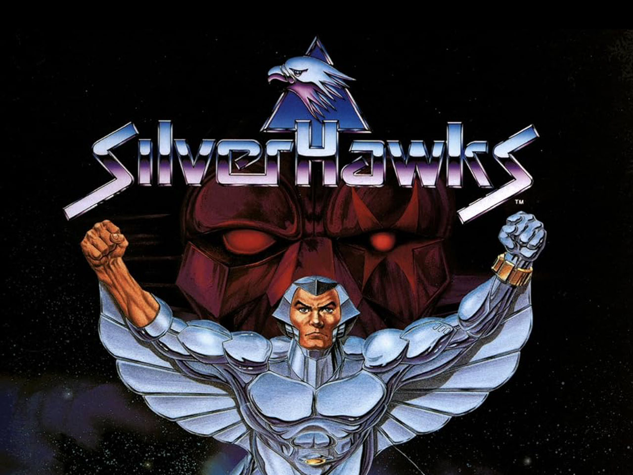
Metallic space heroes. Bird companions. Wings. Villains from a galactic mob. A Rankin/Bass cartoon that felt like a space-age cousin to ThunderCats. Kenner action figures with shiny bodies, character-specific gimmicks, and just enough 1980s science-fiction drama to make the whole thing look like it had been launched from a toy aisle inside a chrome-plated arcade cabinet.
On paper, SilverHawks had a lot going for it.
And yet, the toy line never quite became the long-running hit its visual identity seemed to promise. The cartoon arrived in 1986, and Kenner’s toys followed in 1987, but the line remained relatively short-lived. It is remembered fondly, especially by collectors who love the look, but it never reached the cultural or retail altitude of the biggest 1980s action figure brands.
That is what makes SilverHawks such an interesting Retro Toy Box subject. The concept was strong. The figures looked distinctive. The cartoon had a full syndicated run. The brand had that instant “partly metal, partly real” hook. But looking cool and sustaining a toy line are not always the same thing.
SilverHawks had the shine.
The harder part was turning that shine into a durable play pattern.
What SilverHawks Toys Were
SilverHawks was produced by Kenner as an action figure line based on the 1986 animated series developed by Rankin/Bass and distributed by Lorimar-Telepictures. The cartoon followed a team of partly metal, partly real heroes fighting Mon*Star and his Mob in the Galaxy of Limbo.
The toy line arrived in 1987 and translated the show’s space-cop fantasy into figures, bird companions, vehicles, and action features. The heroes included characters such as Quicksilver, Bluegrass, Steelheart, Steelwill, Copper Kidd, Stargazer, Hotwing, and Flashback. On the villain side, Mon*Star, Buzz-Saw, Mumbo-Jumbo, Mo-Lec-U-Lar, Windhammer, Hardware, and others gave the line a rogues’ gallery with the kind of strange names 1980s toy aisles were legally required to provide.
The basic appeal was easy to see. The heroes were sleek and metallic. Many figures came with companion birds, tying directly into the “hawk” identity. Several had action features, and the line borrowed some of the feel of Kenner’s earlier superhero work while pushing it into a shinier science-fiction direction.
That gave SilverHawks a strong first impression.
The figures looked different from most of what surrounded them. They were not muscle fantasy like Masters of the Universe, not military adventure like G.I. Joe, not transforming vehicles like M.A.S.K., and not monster comedy like The Real Ghostbusters. They were space heroes with metal bodies and wings, which is a clean enough concept to understand from across the aisle.
The Shine Was the First Gimmick
The psychology of SilverHawks begins with the finish.
The heroes were meant to look metallic, and that mattered. In the 1980s toy aisle, surface could do a lot of selling. Bright colors, chrome, metallic plastic, clear parts, holograms, glow-in-the-dark features, slime, and lenticular effects all had a way of making a toy feel special before a kid even understood the character.
SilverHawks leaned hard into that kind of attraction.
The figures looked futuristic because they looked shiny. That may sound simple, but it is important. A metallic-looking action figure communicates a different fantasy than a cloth-uniform soldier or a bare-armed barbarian. It says armor. It says space. It says machine. It says this character is not merely wearing a suit, but may have become the suit.
That was a strong visual hook, especially when paired with the cartoon’s repeated “partly metal, partly real” identity. The toys looked like they belonged to that phrase. You could see the premise in the plastic.
For collectors now, that finish is a huge part of the line’s appeal. A good SilverHawks display catches the eye because the figures do not visually sit still. They reflect light. They look like they were trying to sell the future with every limb.
That kind of shelf presence is powerful.
It can also hide a deeper problem: once a child has looked at the shine, what does the toy do next?
The Bird Companions Were a Smart Idea
The bird companions were one of the line’s better toy decisions.
They gave each figure something extra without overcomplicating the package. A companion bird reinforced the theme, helped distinguish the characters, and gave the child another object to handle. The birds were not just random accessories. They were part of the brand language.
That mattered because SilverHawks needed more than shiny figures. It needed play texture.
A small companion can do a lot of work in an action figure line. It gives the character a partner, a scout, a weapon, a pet, a symbol, or a reason to move through space differently. With SilverHawks, the birds helped the heroes feel like more than chrome people standing around waiting for the next space crime.
They also gave the line a collecting hook. A complete figure was not just the figure. It needed the correct bird and accessories. That makes life more expensive for adult collectors, but as a child-facing toy decision, it helped each release feel fuller.
The idea was good because it extended the core theme without needing a paragraph of explanation. Hawk hero. Hawk companion. Space mission. Done.
The Cartoon Gave the Line a Big World
The SilverHawks animated series aired in syndication in 1986 and ran for 65 episodes. That was not nothing. A 65-episode weekday-friendly run could give a toy line serious visibility, and Rankin/Bass clearly positioned SilverHawks as a science-fiction follow-up to the success of ThunderCats.
The show had plenty of toy-friendly material. The heroes had a base, vehicles, transformations, flight, powers, weapons, sidekicks, and a team structure. The villains had a mob theme, bizarre designs, and Mon*Star as a big central threat. The whole thing had a space-opera setting that allowed almost anything to show up if the episode needed it.
That was useful for the toys because it made the world feel larger than the first few figures.
But there was a complication. The cartoon could show flight, music, space travel, transformations, energy effects, and team action in ways the toys could only suggest. That is true of many toy lines, but it feels especially important with SilverHawks because so much of the fantasy was movement and spectacle. Wings spread. Characters launched through space. Lasers fired. Mon*Star transformed. The team soared.
On screen, that was the brand.
In plastic, some of that energy became harder to capture.
The Toys Looked Cool, But the Play Pattern Was Narrower
This is where SilverHawks becomes interesting.
The figures had a strong look, but the basic play pattern was not as immediately rich as some of Kenner’s other 1980s lines. M.A.S.K. had vehicles that transformed. The Real Ghostbusters had traps, ghosts, slime, and monsters. Star Wars had ships, worlds, aliens, heroes, villains, and a massive cinematic mythology. Even Kenner’s Super Powers line had recognizable DC heroes with simple action features and enormous character familiarity.
SilverHawks had shine, wings, birds, and space cops.
That is not a bad toy concept. It is actually a very strong visual concept. But the child still had to supply a lot of the movement and drama. A winged space hero is exciting, but a figure cannot really fly. A shiny body looks futuristic, but it does not automatically create a repeatable action feature. A companion bird adds personality, but it does not change the play environment on its own.
That may be one reason the line feels stronger in memory and display than it may have felt as an ongoing play system. The look was memorable, but the toy aisle rewards repetition. Kids return to gimmicks they can trigger, worlds they can build, vehicles they can launch, and conflicts that keep expanding.
SilverHawks had pieces of that, but the central hook was more visual than mechanical.
The Villains May Have Been the Best Toy Designs
Like a lot of 1980s toy lines, SilverHawks may have been most interesting when it got to the villains.
The heroes had to share a fairly unified visual identity. That made sense for the show and the brand, but it also meant several of them lived inside the same general design language: sleek, armored, metallic, winged, heroic. The villains had more room to be strange.
Mon*Star looked like the kind of oversized villain a toy line needs. Buzz-Saw, Mumbo-Jumbo, Mo-Lec-U-Lar, Hardware, Windhammer, and the rest of the Mob gave the line more texture because they broke the smooth silver hero template. They were uglier, stranger, bulkier, goofier, and more varied.
That matters for collecting and for play. A team of heroes can look good together, but villains often create the personality of the shelf. They give the world friction. They make the heroes look more heroic by being visually unreasonable in the opposite direction.
SilverHawks understood that. The Mob helped keep the line from becoming nothing but chrome people with bird accessories.
They also showed the version of SilverHawks that might have had more room to grow. The weirder the villains got, the more the line felt like it could become a bigger universe instead of only a shiny heroic squad.
How SilverHawks Fit the Late 1980s Toy Aisle
SilverHawks arrived at a tough moment.
SilverHawks had to compete in that environment with a hook that was visually loud but mechanically less obvious.
That does not mean the toys were weak. It means the toy aisle was unforgiving. A line could have a cartoon, a strong look, and a good concept and still struggle to become a lasting system if the play pattern did not keep escalating. Children needed a reason to want the next figure, the next vehicle, the next base, the next wave, and the next Saturday-morning argument with a parent in the aisle.
SilverHawks had enough identity to be remembered.
The harder question was whether it had enough toy momentum to keep growing.
Why the Line Did Not Last
The Kenner SilverHawks line is generally remembered as short-lived, with the main retail push centered on 1987 and 1988. There were additional items planned, including unreleased pieces that have become part of the line’s collector mythology, but SilverHawks did not continue as a major long-term toy brand.
There is no need to flatten that into one simple explanation.
The cartoon had visibility, but it did not become ThunderCats. The toys looked striking, but the metallic finish may have been more immediately impressive than the action features. The heroic characters had a strong shared identity, but that could also make the lineup feel less varied at a glance. The vehicles helped expand the world, but not enough to turn the line into a massive ecosystem.
And by the late 1980s, the aisle was not waiting around for any brand to find itself.
If a line did not keep moving, another one would. The next cartoon, the next gimmick, the next gross-out figure, the next mutant animal, the next robot, or the next license was always coming. SilverHawks had a memorable look, but memory and momentum are different things.
That difference is where the line lives now.
Why Collectors Still Care About SilverHawks
Collectors still care about SilverHawks because the toys have immediate visual identity.
You do not have to explain the whole mythology for the figures to make sense on a shelf. They look like 1980s science fiction. They look like Rankin/Bass trying to turn ThunderCats energy into chrome space opera. They look like a line that wanted to feel futuristic through surface, silhouette, and theme.
Completeness matters, of course. The bird companions, accessories, action features, and figure condition all affect how satisfying the toys are to collect. The metallic look also creates its own collector concerns because finish and wear become part of the appeal. A shiny line needs to stay shiny to fully deliver the fantasy.
The short lifespan also helps. SilverHawks did not run long enough to become ordinary. It occupies that collector sweet spot where the line is recognizable, visually distinctive, and limited enough that completing it feels like chasing a very specific piece of 1980s toy history.
That is why it still gets talked about. Not because it dominated the decade, but because it looks like it should have.
The Shine Was Real, Even If the Flight Was Brief
The reason SilverHawks toys never quite took flight is not that the concept was bad.
The concept was good. Maybe too good-looking for its own good. The line had a sleek visual hook, a syndicated cartoon, a major toy company, a clear hero team, memorable villains, bird companions, vehicles, and enough space-opera style to stand apart from the fantasy and military lines around it.
But a toy line needs more than a strong first impression. It needs repeatable play, expanding desire, and a reason for each new release to feel necessary. SilverHawks had the look. It had the mythology. It had the shelf presence. What it may not have had was a play pattern strong enough to keep pace with the biggest brands of its era.
That is not a failure of imagination. It is a reminder that the 1980s toy aisle was brutal even to good ideas.
SilverHawks still matters because it remains one of the decade’s most visually specific near-misses. It is a line that collectors remember not only for what it was, but for what it seemed like it could become.
Partly metal.
Partly real.
Still partly unresolved.
